About our work
We fuse data and research, strategy and design to create holistic branding solutions for our clients. At Design Studio 11, each project showcases our commitment to clarifying strategic insights before crafting creative decisions. Our work reflects a deep understanding of each business goal and finding its reflection in brand activation. Explore our portfolio to see how we bring brands to life with precision and creativity.
Fininfo.bg - Branding Project
Startegy, Brand Identity Redesign and Upgrade
Project Overview
Fininfo BG approached Design Studio 11 with a mission: to build a brand identity that would reflect both their current capabilities and ambitious growth trajectory. Recognizing that their existing brand elements lacked the energy and vision to support their goals, Fininfo sought a refreshed identity that could project clarity, trust, opportunity, and collaboration. They were drawn to our ability to align strategic and creative elements, establishing an identity powered by both compelling visuals and resonant verbal assets.
Research & Strategy
To capture the full scope of Fininfo BG’s brand perception and identify areas for growth, we initiated a comprehensive, two-part research process. Together with their team, we conducted nearly 20 external interviews with platform partners and clients, gathering insights on brand perceptions and pinpointing gaps in Fininfo’s current positioning. These interviews highlighted key areas where brand refinement was needed. Additionally, internal workshops with the Fininfo.bg team provided deeper understanding of their business’s foundation, ambitions, and opportunities. These insights enabled us to create a brand identity brief that strategically connected brands' current positioning with its aspirational future.


Design Development
With the desired future state defined, we developed four distinct design routes, each exploring a different facet of Fininfo BG’s brand identity:
- The Trusted Guide – A minimalist and approachable approach, designed to communicate reliability and expertise.
- The Dynamic Innovator – Bold and vibrant, appealing to clients driven by growth and forward-thinking solutions.
- The Strategic Partner – Emphasizing connection and collaboration, this route portrayed Fininfo as a reliable ally.
- The Opportunity Connector – Our chosen direction, symbolizing Fininfo BG as “the place where ideas meet opportunities,” using a logo, slogan, and visual elements that convey connection, potential, and collaborative growth.

Redesigned
Brand Identity
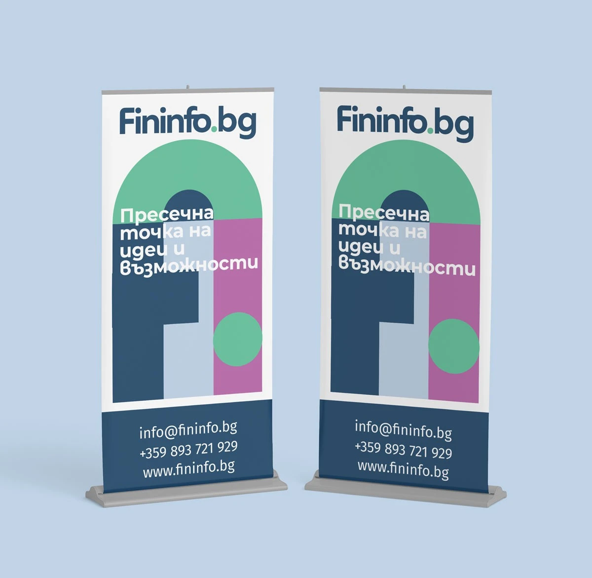
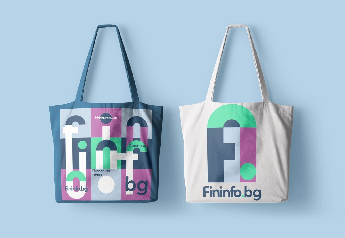
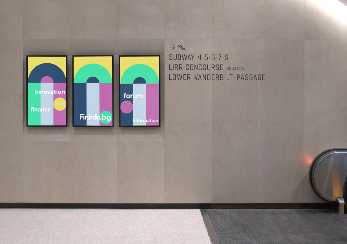
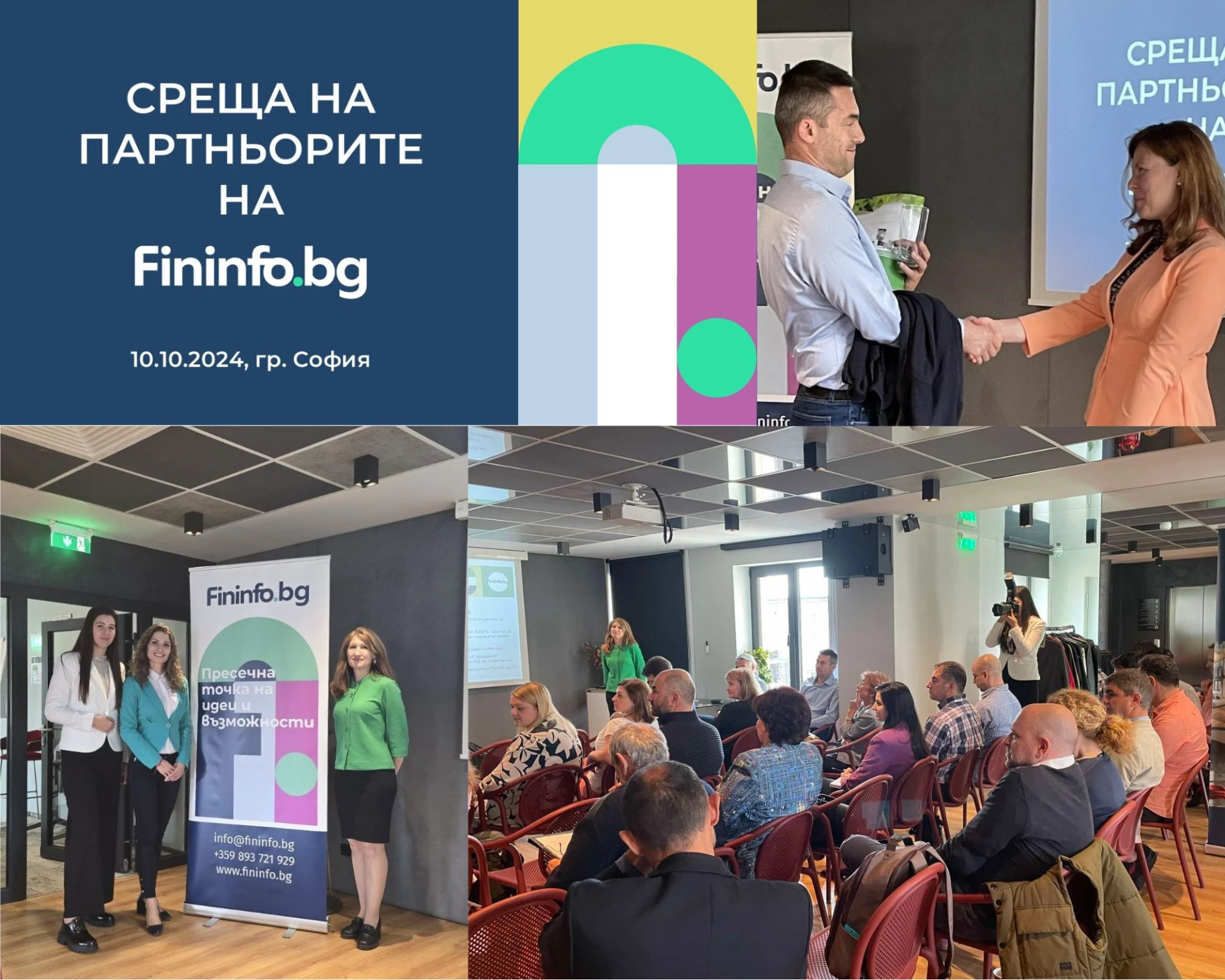
The chosen direction, anchored by the concept of Fininfo BG as a space “where ideas meet opportunities,” established a cohesive and modern identity. This included the development of a humanistic logotype, a vibrant and trust-building colour palette, a digital-friendly logo icon, and clean, humanistic typography. Key communication topics and a distinct visual language of interconnected shapes reinforced the brand’s narrative across every element of the identity. This comprehensive identity not only represents Fininfo’s strengths but also embodies its aspirations for growth, creating a trustworthy and forward-looking brand presence.


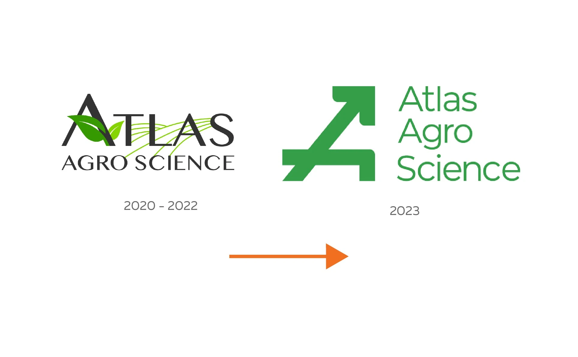
Re-Branding project for Atlas Agro Science
Sector: Biostimulants, Green innovation, Landscape and Agriculture
Diciplines: Branding / Strategy / Brand Identity / Print / Web Design / Corporate materials
The Strategy and Narrative:
Our research clearly showed that the company's differentiation factor revolved around the real nature of their product and its patented process. Their approach towards eco topics differed significantly from other organic or bio fertilizer opportunities on the market. The company's innovation lay in making its products out of dangerous waste, embodying the essence of true upcycling: transforming the hazardous into the beneficial, the unsightly into the beautiful, and the process of improvement itself.
The Project:
Atlas Agro Science, an award-winning Bulgarian startup renowned for its eco-friendly solutions, approached our team with a clear objective: to enhance trust and showcase their company's credibility. Specializing in green innovation, Atlas Agro Science has developed a patented process that converts sludge from Wastewater Treatment Plants into beneficial products. With the company's growth trajectory, they sought our expertise to position their products and startup as a credible alternative to chemical soil fertilizers.

In developing the strategy and main narrative for Atlas Agro Science, our primary focus was on establishing its credibility and showcasing their commitment to green innovation through upcycling. Our narrative centered on emphasizing the environmental benefits of their products and their dedication to sustainable practices. By positioning Atlas Agro Science as a credible and trustworthy brand, we aimed to resonate with environmentally-conscious consumers and industry stakeholders alike.
The Design Approach:
With upcycling as our guiding principle, we approached the design process delivering modern, colorful, and technology-driven identity. We focused on conveying the idea of renewal and upgrading messages, combined with innovation, professionalism, and reliability. As the cornerstone of the new identity, we crafted our own typographic style, called Atlas Display, available in both Latin and Cyrillic scripts, symbolizing the rewriting of the world's future in a new way. We decided to employ a vibrant color palette, featuring not only green but also a range of vivid and optimistic colors, reinforcing the brand's connection to nature, beauty, and sustainability. Based on this, we developed a full brand identity and marketing materials package, supporting various activation opportunities in social media, conferences, and outdoor activities.


"The Design Studio Eleven' team has provided us with one of the best and most professional relationships we could have hoped for. From building the brand identity to completing the entire project, their team took care of every detail. We are satisfied and recommend their services!"
Nikolay Minkov - Marketing and Communication manager
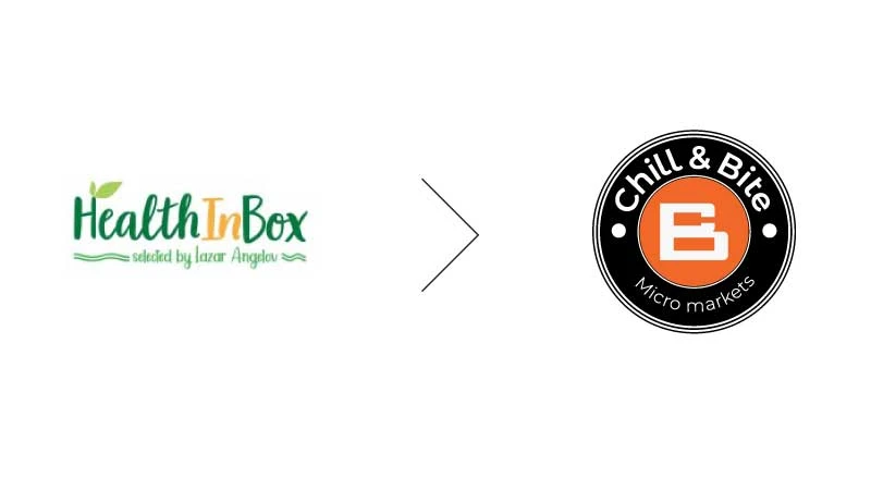
Energize & Rebrand for Chill&Bite
Sector: Retail, Food&Bevaridge innovation
Diciplines: Branding / Strategy / Brand Identity / Print materials / Place design
The project:
Chill & Bite, a refreshing micro markets chain concept in the office and coworking places landscape. It presents a unique fusion of high-quality energizing food and drinks, modern cashless technology, flexible space design, and relaxation vibe for young professionals. The startup co-founders approached us at a pivotal moment in their innovation development, transitioning away from their old proposition and name, Health in Box. They sought our expertise to help rebrand their innovation as a flawless technology haven for those seeking a balance between unwinding and indulging while at work.
The Strategy and Narrative:
Chill&Bite strategy centres on seamlessly integrating technology, convenience, and relaxation to create a unique oasis within the bustling work environment. The brand narrative is crafted around the concept of "office energy stations," offering a friendly and welcoming atmosphere where individuals can recharge and refuel amidst their busy schedules. Our rebranding approach emphasizes positioning Chill & Bite as a haven for professionals seeking a moment of respite, where they can unwind, indulge in delicious offerings, and enhance productivity. Through a friendly and inviting tone of voice, we aim to create a warm and welcoming atmosphere that resonates with our young international audience.

The Design Approach:
In reimagining the brand, our design approach harmonizes modernity with comfort, starting with the new brand name, Chill & Bite. The logo serves as a visual representation of the brand's ethos, blending design elements from craft beer and coffee aesthetics with a nod to the welcoming ambiance of the market. The chosen colour palette reflects vibrancy, energy, and sophistication, evoking a sense of revitalization and pleasure. Brand voice plays a pivotal role in conveying the brand's personality, with a focus on mix optimism and recharge, modern, and evergreen, elegance and everyday comfort.


New brand positioning and Identity for Gomotartzi Wine Brand

The buisness challange:
How to improve brand Differentiation, supporting better Penetration in big wine consumption occasions?
The consumer brehavior change:
Start consideration and buy Gomotartzi products in Get together In & Out of home occasions
The design objective:
Create relevant and differentiated visual and verbal messages to connect the brand with Get Together occasion
The project description
At a previous stage, together with the marketing and sales team of the company, we developed a marketing strategy for the products of Bononia Estate. Based on the brand's uplifting cycle, and with the desire to strengthen in the best way the next phase of the development of Bononia Estate's business, we are designing a new visual language for Gomotartzi.
Project deliverables consisted of:
- Research and analysis
- Development of New brand messages and slogan
- Complete graphic language and style of communication
- Typography and Brand Icons
- Colour palette
- Visuals grid and organization
- POSM design, etc.
As the center of our creative proposal, we have used the notion that the brand name Gomotartzi has the meaning of "noise of people getting together". So our explication was focused on empowering that signal in visual and verbal way. We have developed brand icons, typographical expressions and colout pallet applicable in numeros executions, supporting brand differenciators and product specifics in coherent way.

